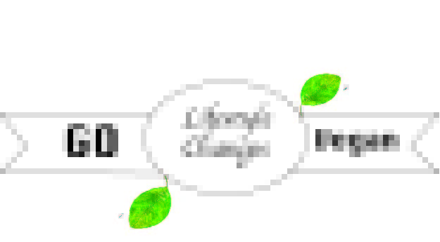
I decided to create a graphic that looks like a health advertisement logo because my main topic is about lifestyle changes and improving your diet, which is why I put “lifestyle changes” in the middle to emphasize my topic. What inspired me to make this logo was the health brand that I used to follow at home that includes tips to improve your habits and easy to make vegan meals and how to keep it up. Some research I did to verify this logo was looking into the brand and their logo meaning and what it means to them, since their intention or how the logo is portrayed can be viewed differently by the consumer if they are not careful. For that reason, I decided to add leaves to my logo because they are commonly viewed as natural and I associate them with health and a vegan lifestyle. To create this draft, I used the tools from the adobe illustrator tutorials since the entire logo is shape based besides the inserted text-boxes. I used the selection tool to draw the rectangles inverted edges so that it matches the rectangle width. Since this is a draft, I haven’t added much color yet but I plan to add color with the gradient process to all flat colors. I also used the direct selection tool to adjust the outside corners of the banner to give it the appearance of being more natural. I also bolded the text in the outside of the banners and made the center text cursive to give it depth. A problem I ran into while creating this draft was that I had trouble finding the reset or erase tool, which isn’t much of a huge issue but was frustrating at first since it is all line based it took me a few times to get it correct and every time I would have to restart.

