Month: October 2019
Raw Audio Footage
Audition Tutorials
Logo Project Final
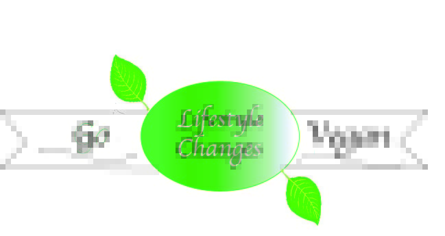
At the beginning of this project, my idea was to create a logo that represented my topic clearly and in two separate ways; visually and through the words that are displayed. I started with wanting to create some sort of banner, I chose this because my topic is about repressing a healthy lifestyle and more specifically, going vegan. This type of logo reminded me of the logo that initially prompted me to begin my lifestyle-changing journey. The logo represents a banner of accomplishment since going vegan is a major lifestyle change, and the colors I chose are green because it is commonly associated with health and natural factors. I also included the leaves to be an eye-catcher since I decided to leave the outside banner white.
I started by drawing my banner and knowing I wanted to include both sayings into my logo while still keeping it somewhat simplistic. After creating my draft, I got feedback that I agreed with and decided to change before submitting my final draft. Initially, I had two different fonts within the logo because I thought it gave perception of the different words and differentiated them showing that they both represented different things. But after receiving feedback, I saw that it made the whole logo look less cohesive, so for my final I decided to keep the same font throughout the entire logo. I also had included two leaves on the outside of the banner to add additional attention to the logo, but looked less high-quality and took away from the words. I changed this by using the vector tool and creating my own leaves with contrasting, vibrant colors that brings the whole piece together. I added color to everything by putting a green in the middle center where the main focus words are; I chose green because it is eye-catching and easily connected to healthy and natural perceptions; I decided to leave the outside portion of the banner white because I did not want to add too much color and take away from the logo. After adding color by using the fill tool, I created a gradient to make the color look less blocky and more official. After changing the font to all match, I used the straight line tool to create two matching lines to put underneath the words “Go Vegan”, then I used the invert tool to curve them and put them to underline the already cursive fonts on the banner.
Draft Logo Project
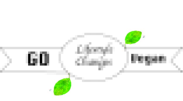
I decided to create a graphic that looks like a health advertisement logo because my main topic is about lifestyle changes and improving your diet, which is why I put “lifestyle changes” in the middle to emphasize my topic. What inspired me to make this logo was the health brand that I used to follow at home that includes tips to improve your habits and easy to make vegan meals and how to keep it up. Some research I did to verify this logo was looking into the brand and their logo meaning and what it means to them, since their intention or how the logo is portrayed can be viewed differently by the consumer if they are not careful. For that reason, I decided to add leaves to my logo because they are commonly viewed as natural and I associate them with health and a vegan lifestyle. To create this draft, I used the tools from the adobe illustrator tutorials since the entire logo is shape based besides the inserted text-boxes. I used the selection tool to draw the rectangles inverted edges so that it matches the rectangle width. Since this is a draft, I haven’t added much color yet but I plan to add color with the gradient process to all flat colors. I also used the direct selection tool to adjust the outside corners of the banner to give it the appearance of being more natural. I also bolded the text in the outside of the banners and made the center text cursive to give it depth. A problem I ran into while creating this draft was that I had trouble finding the reset or erase tool, which isn’t much of a huge issue but was frustrating at first since it is all line based it took me a few times to get it correct and every time I would have to restart.
Logo Sketch Draft

This is my logo sketch draft, its a ribbon representing the accomplishments of a lifestyle change but also promoting veganism by bolding the “Go Vegan” to give it the advertisement effect.
