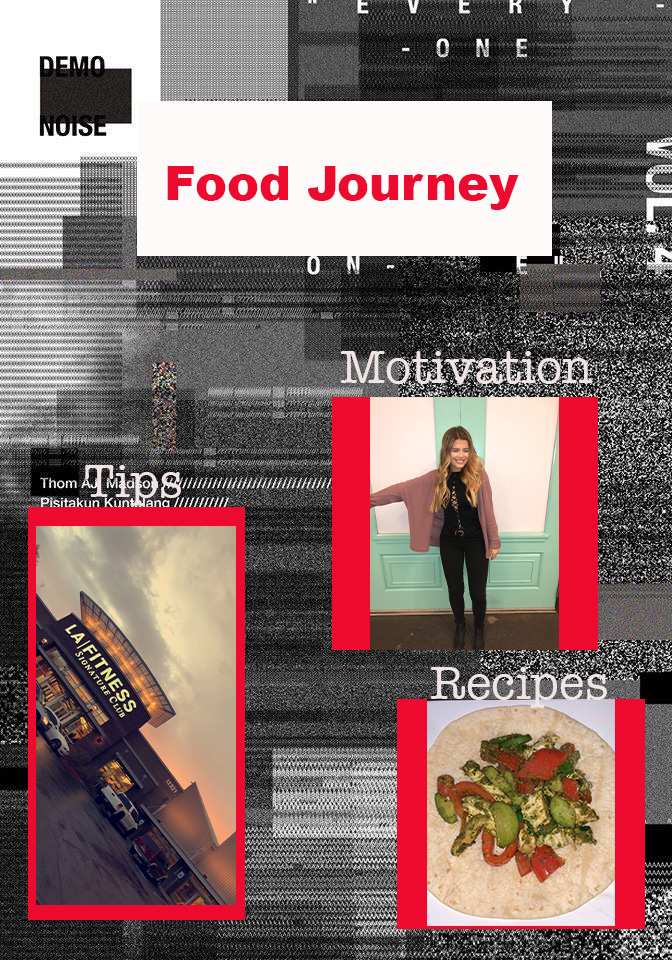
I created this graphic design to represent the importance of my health and fitness journey and a magazine is a good portrayal of this type of lifestyle. For me, all of the factors during this journey were crucial to my success in up keeping my lifestyle which is why I chose these 3 pictures to represent my topic of going vegan and creating the start of my fitness journey. Three main factors in this were the meals I created, the upkeep of going to the gym and keeping myself busy, and the motivation I gave myself to keep going since this process is not a short one. I chose to make it a magazine because this is the most common form of inspiration, in my opinion, for journeys and food recipes. To create this Magazine draft, I used a mesh background from a site (link below) and then embedded my 3 photographs with a red background to contrast them from the background to give it the look of a magazine. This style of draft inspired me because when I was first starting my vegan journey and going to the gym, I looked mainly for inspiration and magazines or blogs that caught my eye from people who had previously done the same thing to get myself on the right track. Since the three elements in my topic are related but not very similar, it seemed best to create three various sections on the post to clarify what they are and why they are important. The only challenge I had while creating this in the software, was that I was having a difficult time finding a way to make the borders of these photos project from the background more and make them look like they are a part of the page, my plan to fix this is to blend it in to the first layer and then use the grunge texture to give it the paper look.
I really like your graphic design. It is interesting and inspiring. The colors, pictures, font type, and idea is very cool! The only couple things i would say for 2 critical suggestions that I have for improvements include, one being to blend the boarders on each of the 3 pictures more. You already mentioned making this change in your writing underneath and i completely agree! A second change that I suggest is maybe adding a couple more photos just to show more of your fitness journey! This will add more and help people understand even more of your journey with visuals. One area where i think the design is already strong is in the way that it is eye catching and cute! I also liked reading about your fitness journey in your writing! Good job! I think just making those little changes will make it even better but it is already good!
I really like the strong red color and how it contrasts with the background, it really gives off the feeling of a magazine. However, I feel like you can add a bit of text in the background regarding your journey (similar to those that appear on magazine covers). There seems to also be the need to blur the background or parts of the background with words as it is overlapping with some of your text(Tips), it just makes it hard to see. Overall, the design is pleasing to the eye and the photos pop up well!
I find your graphic design super interseting and unique! I enjouy the colors you chose to use they contrast well with the theme you already have going for your blog. Two things I think would be beneficial for this graphic design is adding more text into the design. For example put text boxes on top of your pictures and add a couple words or sentences that are relate to your journey. By doing this I believe it will give someone a better understanding of what they are looking at before they read your writing about it. One other thing that may be helpful is adding a few more pictures. By adding some more images it could show how your journey is going in a little bit more depth. Other than that, everything looks amazing!
For a self critique, I think that I can work on changing the borders so that they are more even, and blending them like I said in my blog post comment to give it more of a magazine feel. I also think I could work on the overall texture of this graphic so that everything looks put together. An idea I have for that is to make the background crumpled like we created on the tutorials assignment and lightening the colors behind the photos since the red is a high contrast to the black and white background. Another aspect I plan to change is to add more words that relate to my topic. I want to make my graphic have the impression of a motivational magazine cover so I plan on adding additional sayings that relate to my topic and why its important to me.
As a whole, the graphic design was visually appealing and gave a clear message of a fitness/ health journey that Isabelle is on. The color scheme and the modern vibe is an eye catcher as well. One suggestion I could give is to maybe use a more high-quality picture for the recipes/food image so that it could possibly match better with the modern, clean look that is going on. However, the LA fitness goes really well with the overall theme being produced. I like that you are going for a magazine look, because they do tend to catch my attention more than a research plan would. Another suggestion I have that could enhance that magazine effect would be to maybe make an image or word pop or obviously catch one’s attention. Other than that, the overall image and use of photoshop is nice and appealing.

I really like your graphic design. It is interesting and inspiring. The colors, pictures, font type, and idea is very cool! The only couple things i would say for 2 critical suggestions that I have for improvements include, one being to blend the boarders on each of the 3 pictures more. You already mentioned making this change in your writing underneath and i completely agree! A second change that I suggest is maybe adding a couple more photos just to show more of your fitness journey! This will add more and help people understand even more of your journey with visuals. One area where i think the design is already strong is in the way that it is eye catching and cute! I also liked reading about your fitness journey in your writing! Good job! I think just making those little changes will make it even better but it is already good!
LikeLike
I really like the strong red color and how it contrasts with the background, it really gives off the feeling of a magazine. However, I feel like you can add a bit of text in the background regarding your journey (similar to those that appear on magazine covers). There seems to also be the need to blur the background or parts of the background with words as it is overlapping with some of your text(Tips), it just makes it hard to see. Overall, the design is pleasing to the eye and the photos pop up well!
LikeLike
I find your graphic design super interseting and unique! I enjouy the colors you chose to use they contrast well with the theme you already have going for your blog. Two things I think would be beneficial for this graphic design is adding more text into the design. For example put text boxes on top of your pictures and add a couple words or sentences that are relate to your journey. By doing this I believe it will give someone a better understanding of what they are looking at before they read your writing about it. One other thing that may be helpful is adding a few more pictures. By adding some more images it could show how your journey is going in a little bit more depth. Other than that, everything looks amazing!
LikeLike
For a self critique, I think that I can work on changing the borders so that they are more even, and blending them like I said in my blog post comment to give it more of a magazine feel. I also think I could work on the overall texture of this graphic so that everything looks put together. An idea I have for that is to make the background crumpled like we created on the tutorials assignment and lightening the colors behind the photos since the red is a high contrast to the black and white background. Another aspect I plan to change is to add more words that relate to my topic. I want to make my graphic have the impression of a motivational magazine cover so I plan on adding additional sayings that relate to my topic and why its important to me.
LikeLike
As a whole, the graphic design was visually appealing and gave a clear message of a fitness/ health journey that Isabelle is on. The color scheme and the modern vibe is an eye catcher as well. One suggestion I could give is to maybe use a more high-quality picture for the recipes/food image so that it could possibly match better with the modern, clean look that is going on. However, the LA fitness goes really well with the overall theme being produced. I like that you are going for a magazine look, because they do tend to catch my attention more than a research plan would. Another suggestion I have that could enhance that magazine effect would be to maybe make an image or word pop or obviously catch one’s attention. Other than that, the overall image and use of photoshop is nice and appealing.
LikeLike