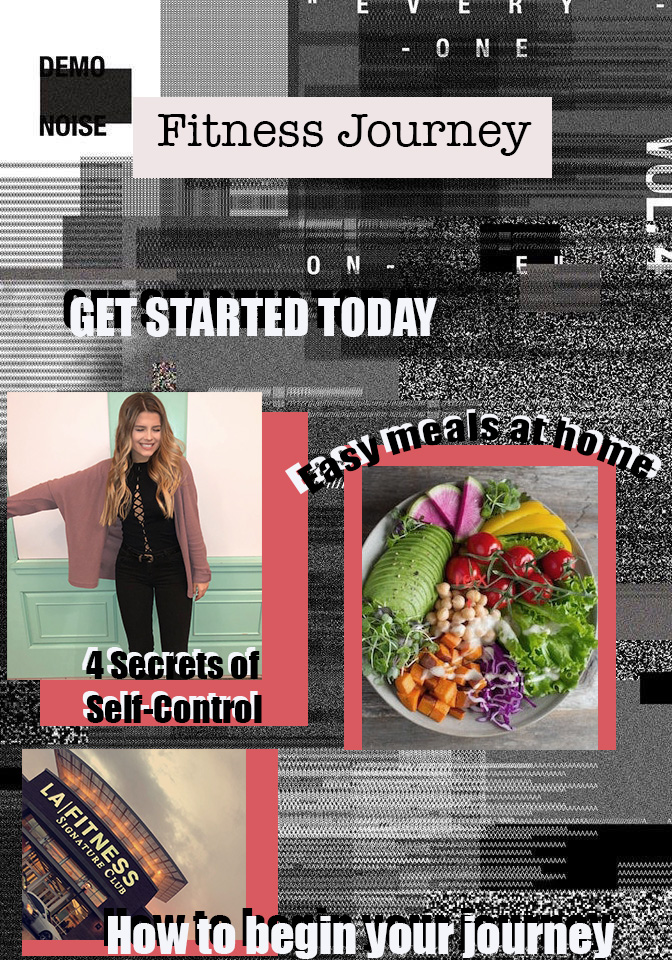
I created my graphic design in resemblance of a magazine because this platform best portrays my topic and what I want to get across to my intended audience. My chosen topic is my fitness journey, which includes going vegan and changing my lifestyle habits. I wanted to create a design that resembled what I used to start my journey and what intrigued me to look into this more. All of the factors during this journey were crucial to my success in up keeping my lifestyle which is why I chose these 3 pictures to represent my topic of going vegan and creating the start of my fitness journey. Three main factors in this were the meals I created, the upkeep of going to the gym and keeping myself busy, and the motivation I gave myself to keep going since this process is not a short one. During the initial draft, I aimed for the pop-art look for my photographs to highlight the most important factor of the graphic. I embedded 3 photographs above my mesh background (link below) and then included adobe draw boxes and layered the photos on top with a bright, contrasting color to emphasize the pictures. On top of the photos I includes brief wording to explain what the significance of each photograph was. After getting feedback, I received helpful tips to put together the entire project by adding more quotes and wording to define each meaning of the photos and to increase the quality of the pictures. I decided to double layer my titles of each photograph and bring in more intriguing wording into the magazine in hopes to bring the audience in more. I changed the contrast of the background to help blend everything in easier so that it doesn’t look thrown onto the background, after doing this I decided to double layer the text to give it a shadowed look and arc the words above a photograph and sentence that I want emphasized onto the page. I also agreed from my recent feedback that it was important to add another text box that fills the graphic since magazines most often have many short sayings and texts giving examples of the context of the articles. After completing all steps, I went into the layers into the “Half and Half Cookie button” and decreased the hue and saturation to dim the red contrast with the background to help the overall look of the page and then created a white layer underneath the red to emphasize the picture and differentiate between the black and white and just a red square.
https://www.pinterest.com/pin/235172411774562940/
